
The premier digital reading app for comic books, graphic novels, and manga.


BACKGROUND
The objective of this design project was to simulate a professional environment, make strategic design decisions within business constraints, and analyze similar problems solved by industry leaders. Students were given a list of business scenarios to use as the foundation of our project. After selection, students then created a fictional company that would operate in the business scenario and design a solution based on the business need of the scenario provided. For this project, I opted to design for a media company that specializes in providing a digital platform for comic books, manga, and graphic novels that I dubbed ComicCache.
TIMELINE
3 weeks
MY ROLE
UX Designer, UX Researcher, UI Designer
DELIVERABLES
A minimum viable product for a new onboarding process and plan upgrade process
TOOLS USED
Figma, Google Doc, Adobe Illustrator, Adobe Photoshop, Pen + Paper
PROVIDED COMPANY CONTEXT AND BUSINESS GOALS
ComicCache launched a digital reading platform for comic books, manga, and graphic novels two years ago. It is a freemium model that has a mobile-web experience and a mobile app for both iOS and Android.
The company’s business strategy was to first build a user base by offering a free-to-use platform and then evolve the feature set so they could monetize on a premium (paid) product.
At this point, the product has been well received and has a healthy user base of free users. They now need to design an experience that will allow users to subscribe and pay a monthly fee. The business goals are as follows:
-
Create the opportunity for new users to subscribe to the premium product upon registration in the signup flow.
-
Create the opportunity for returning free users to become paid subscribers within the product (once logged in).
Target User:
-
18-24 years old
-
Very tech-savvy - they are on their phones for several hours a day
-
Very budget-conscious
-
Comic books, manga, and graphic novels are a very important part of their lives
Brand personality:
-
Uniquely diverse, but somehow always familiar. This creates the need for design to balance that tension
-
Bold, smart, and hip.
PROJECT GUIDELINES
-
The existing signup flow does not have a call to action upon registration that gives the user the opportunity to subscribe.
-
The existing flow does not have prominent calls to action throughout the free experience that gives the user the opportunity — or a compelling reason — to subscribe.
-
By creating a paid product with better features than the free experience and giving users the opportunity to upgrade to a better product, users will pay the subscription fee. This will lead to a profitable revenue stream.
INDUSTRY LEADERS RESEARCH
To fully understand the problem, I decided to research how other media companies have solved similar business problems, such as YouTube, Spotify, and Pandora.

YouTube
+ Premium benefits are laid out
+ Multiple plans presented
+ Confirmation pop-up and dedicated welcome screen
+ Opportunity for other upgrades
- Onboarding has too many screens
- Unable to sign up for Premium plan during signup process

Spotify

Pandora
+ Opportunity for user to curate their own media after onboarding
+ Simple onboarding process
+ Short upgrading process
- Unable to upgrade for Premium plan during signup process
- Doesn't entice users to upgrade
In addition, I analyzed how two direct competitors, DC Universe Infinite and Shonen Jump, set up their onboarding and upgrading process, mainly in how they structured their user interface and information architecture. I also took cues for how they steer users to upgrade to a paid subscription.


HOW MIGHT WE...?
After reviewing and synthesizing the provided research, I reframed the problem into a series of "How Might We" (HMW) questions to act as my north star for the rest of the sprint:
-
How might we add the opportunity to become a paid subscriber to the signup flow without extending its length?
-
How might we nudge the returning users to become a paid subscriber with multiple access points?
-
How might we convince the user that the benefits of being a paid user is worth the subscription?
-
How might we design the user interface to be bold and unique while also being familiar to the user?
MAPPING USER FLOWS
I mapped out two flows that will lead users to opting for a premium subscription:
-
An onboarding flow with an opportunity for the user to elect for a premium subscription immediately.
-
Upgrading flows for returning users to access the upgrade screen through multiple access points.
Onboarding Flow


Upgrading Flows
IDEATION SKETCHES
After analyzing the other media apps and how they structured their interface and flow, I sketched through some user interface layouts so I can transition into wireframes quicker.

Screens include onboard welcome page, various subscription selection screens, and homepage.
LOW FIDELITY WIREFRAMES AND FIRST USABILITY TESTING


After designing wireframes for the core screens of the app, I conducted a preliminary usability test for potential users that fit the company's target demographic and was given the following comments:
-
The paths to upgrading the subscription plan felt intuitive. The multiple access points made it easy to navigate through.
-
Likes that the user-provided info for onboarding is all laid out on a single screen.
-
Some elements on the homepage feel a bit cluttered, could let them breathe a bit.
-
Some buttons feel too big.
-
Would like to see an aesthetic that feels like a comic book / graphic novel. Reference the Spiderverse animated movies.
STYLE INSPIRATION
Per the feedback received, I established a comic book-esque aesthetic for the app that feels fun and distinct yet familiar to the user and easy to navigate. It was important to incorporate key comic book elements such as halftone gradients and a CMYK-inspired palette, the printing system that comic books are typically produced in. These are represented in the ComicCache logo, the primary call-to-action button, and header backgrounds for cards.


HIGH FIDELITY SCREENS AND SECOND USABILITY TESTING


After applying the style inspiration to the wireframes, another round of usability testing was done. Key inights include:
-
Have more graphic variety for the ad banners. The app also includes manga so maybe try manga-inspired graphics.
-
Consider shrinking the icons on the bottom navigation menu.
-
The design language is fun and feels inspired by the comic book / graphic novel world.
-
For the Create Account screen, try underlines instead of boxes for a cleaner appearance.
Before


After


Incremental improvements to the interface per user feedback.
FINAL DESIGN SOLUTION
ComicCache hosts digitalized content from major publishers such as Marvel Comics, DC Comics, Image Comics, and Shonen Jump to smaller, indie brands like Boom! Studios, IDW Publishing, and Dark Horse Comics making them the premier digital reading app for comic books, manga, and graphic novels.
After two years of offering a "freemium" model, they added a premium subscription that can be accessed during the onboarding process for new users. Returning users are also able to upgrade their free subscriptions in app via multiple routes.
PREMIUM SUBSCRIPTIONS

ComicCache's four premium subscription plans allow users to have broader access to their 30,000+ book library.
-
The Monthly and Annual plans are staples to subscription-based models.
-
The Annual Plus subscription gives the biggest fans full access to the ComicCache library with only a one week waiting period for digital access. In addition, these subscribers are rewarded with exclusive, collector's items that can only be obtained through this premium plan.
-
The Student Plan is a budget option for students. Given the company's target demographic of 18 - 24 years old, this plan makes converting from "freemium" to a paid subscription much cheaper for the user.
ONBOARDING PROCESS


Per the business goals, the company wanted to create the opportunity for new users to subscribe to the premium product upon registration with the free subscription being relegated to the bottom. In the onboarding flow, I wanted the option for the premium subscription to be available to the user in the fewest screens possible. The four premium subscriptions are shown to the user by screen 3 and by screen 6, the new user has finished their registration process.
UPGRADING SUBSCRIPTION VIA HOME SCREEN


The other business goal was to create opportunities for returning users to become paid subscribers within the app. To solve this, I wanted to have multiple flows that would result in an opportunity to upgrade. The first flow would be accessed by simply clicking a banner ad on the homepage. The ad banners on the homepage would use graphics of popular characters along a call-to-action button.
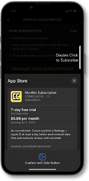
UPGRADING SUBSCRIPTION VIA SETTINGS


The next upgrade flow would be located in the Settings under Manage Subscription. Since this flow is commonly used in other media companies, it made sense to include it. Within that screen, it would show the user's current plan and its benefits. For free users, it would make theirs look limited compared to the premium options, thus enticing them to upgrade.
UPGRADING SUBSCRIPTION VIA PAYWALL


Much like the DC Universe Infinite and Shonen Jump apps, ComicCache locks content behind paywalls to entice them to pay and unlock it. The locked issues are indicated by the "Join to Read" button. If selected, a pop-up asking the user to upgrade will appear and display its benefits.
REFLECTION
Over the course of this project, I learned how to strategize my design choices to solve business problems quickly and efficiently. For example, analyzing competing apps and how they solved similar issues streamlined how I was going to approach my solutions.
I also learned that sometimes you need to let the design elements breathe by allowing more space in between them. Before I would like to pack as much information as I can, but after referencing other mobile apps, I saw how generous they were with their spacing and ultimately how much better the interface was because of it.