
A four week website redesign

BACKGROUND
Springboard's final design project is a group project meant to simulate real-world experience with actual companies. The design brief is dependent on the company's business goals. We were tasked with redesigning a website for Fall Obsession, a hunting and outdoor media production company and an outdoor promotion agency. They produce a wide variety of content, including videos, podcasts, educational articles, gear reviews, photography, and much more. They would like to explore re-designing their current website with a prototype that exhibits innovative and fresh UI and UX ideas that will improve their users' experience.
TIMELINE
4 weeks with weekly client meetings
MY ROLE
UX Designer, UX Researcher, UI Designer, Design Systems
DELIVERABLES
4 redesigned screens and basic design system that provides design direction for web development moving forward
RESEARCH AND ANALYSIS
PROJECT OBJECTIVES
-
Conduct a design audit of their current website and identify key areas of improvement.
-
Drive user engagement with media production that already exists on the website (e.g., podcast, video series).
-
Utilize design to increase our brand identity as a knowledge base/experts on outdoor products.
-
Drive users to learn more and contact them about custom-produced media.
MEETING OUR CLIENT
We set up weekly video meetings with Drew Tvrdik, Vice President of Brand Marketing, to discuss the company and share the project's progress. For our first meeting, Drew walked us through the project and shared key information such as their target demographic and areas of focus and improvement. It was important that Drew reiterated the project objectives in his own words for us to establish a mutual understanding of what is expected.
Key Insights:
-
Target Demographic: male, 18 - 35 years old, blue collar workers, mostly residing in Southeast USA.
-
Areas of Focus: Drive new users to media content and apparel storefront since that provides the company revenue.
-
Areas of Improvement: Restructure information architecture to be more efficient and improve buyer's journey
DESIGN AUDIT
To begin the redesigning process, the team and I conducted a design audit of Fall Obsession's current website to see what we were working with. We found their website to be poorly organized, cluttered, and jarring to look at in some areas.

For the homepage, we immediately wanted to simplify it because look how long this screen is.
...
......
.........
............
...............
..................
.....................
........................
...........................
..............................
.................................
..............................
...........................
........................
.....................
..................
...............
............
.........
......
...
......
.........
............
...............
..................
.....................
........................
...........................
..............................
Keep going....
..............................
...........................
........................
.....................
..................
...............
............
.........
......
...
......
.........
............
...............
..................
.....................
........................
...........................
..............................
.................................
..............................
...........................
........................
.....................
..................
...............
............
.........
......
Almost there...
......
.........
............
...............
..................
.....................
........................
...........................
Finally at the end!
There's just too much packed into the homepage, elements are unnecessarily large and have inconsistent spacing between each other, and the orange backgrounds need to be reduced to an accent color instead. And most importantly, we weren't sure what Fall Obsession wanted to be portrayed as because there was too much information being shown.


The media pages were much more digestible, but still required improvement. Each podcast episode had its own separate audio and video page and we wanted to condense that into a single page, effectively reducing the page count by 50%. The pages also didn't provide the option for streaming on other platforms Fall Obsession is present on, such as Spotify and Apple Podcasts.
The storefront page also suffered the same issues at the homepage: too long and cluttered!
...
......
.........
............
...............
..................
.....................
........................
...........................
..............................
.................................
..............................
...........................
........................
.....................
..................
...............
............
.........
......
...
......
.........
............
...............
..................
.....................
........................
...........................
..............................
Not as bad but still quite long, especially for the amount of products shown. We want to completely redesign their storefront to resemble a more traditional e-commerce interface.


The product page screens themselves aren't too bad but they would benefit from a reorganized interface and the inclusion of color selection buttons and product previews.
We also laid out the website's information architecture (IA), mainly the navigation bar. My team and I found the navigation bar to be too confusing. For example, there's a section for video series, media, articles, and reviews even though they all should be condensed into one section. Other sections such as contests, pro shop finder, and sponsors didn't add to the user's experience and only cluttered the navigation bar more.

COMPETITOR ANALYSIS
After breaking down Fall Obsession's website and IA, we looked into some of their competitors' websites, other media companies, and outdoor retailers to learn how they structure their IA and content.

Competitor: The Hunting Dog Podcast
-
Direct competitor within the outdoor-hunting media space.
-
Much cleaner user interface, not as overwhelming or cluttered. Some elements can be given more room to breathe, but overall good.
-
Well-organized content and structured information architecture.

Media Company: The Ringer
-
The Ringer is a multi-media sports production company. Their IA is well-organized despite having a massive content library.
-
They're immediately recognizable as a media company because their content is the first thing you see.
-
Navigation bar is simple and easy to use.

Outdoor E-Commerce: Patagonia
-
Patagonia is a industry-leading outdoor clothing company with an easy-to-use e-commerce page.
-
User interface isn't innovative, but is very effective and easy to navigate around.
-
Product cards have plenty of information before even clicking it (colors, prices, reviews, best seller, etc.)
PERSONAS
Since there are two key user journeys to improve, we decided to do two personas: one for media and one for e-commerce

Will, the Podcast Fan
Attributes
-
25 years old
-
Works in HVAC
-
Hunting fan with a growing enthusiasm for the sport
Goals:
-
Wants to stay up-to-date with the latest hunting news.
-
Likes learning new techniques and tricks.
-
Wants to be more involved within the community.
Pain Points:
-
Too many avenues of consumption, wants to centralize all of his media into a single source of content.

Alec, the Outdoor Consumer
Attributes
-
32 years old
-
Wildlife biologist
-
Lifestyle revolves around his love for the outdoors
Goals:
-
Find hunting apparel from brands he's a fan of.
-
Engage with like-minded communities.
Pain Points:
-
Lack of trust in product quality.
-
Inconvenient navigation.
HOW MIGHT WE...?
After reviewing and synthesizing our research and design audit, we reframed the problems into a series of "How Might We" (HMW) questions to act as our guidelines moving forward:
-
How might we redesign the website's interface to be more user-friendly and aesthetically modern while retaining the spirit of the Fall Obsession's original design intent?
-
How might we improve engagement for the media pages and e-commerce storefront for new and returning users?
-
How might we promote Fall Obsession as a premier platform of outdoor and hunting media content?
DESIGN PROCESS
RESTRUCTURING THE INFORMATION ARCHITECTURE
Before beginning the ideation phase, we revised the current IA to be simpler by reducing the navigation bar by 50%. We compartmentalized all 4 media categories into one section, removed unnecessary sections that didn't provide value to the user experience, and added a search function to easily look through their content archive.

The initial revised information architecture with sub-sections listed below.
EXPLORATION SKETCHES
To kickoff our design process, we wanted each group member to explore concepts individually to allow us to interpret the research without bias and express our design solutions freely. Afterwards, we reconvened to establish commonalities between our processes and introduce new ideas to others.
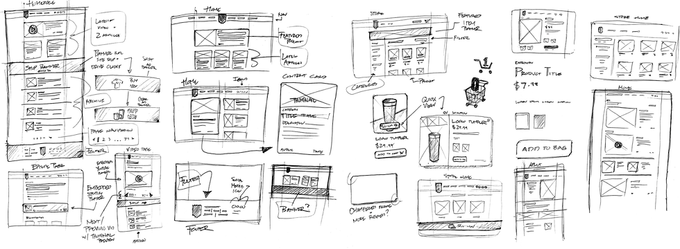
My initial sketches focused on homepage and storefront layouts and elements.
INTERFACE INSPIRATION
Gathering inspiration from other websites such as the aforementioned Patagonia and The Ringer as well as other websites within the same realm as Fall Obsession - hunting, media, and outdoor e-commerce.

WIREFRAMES
Based on our updated IA and inspiration, my team and I did separate iterations of the homepage design. For my homepage design (option 2), I focused on presenting their content more like a blog site because their original homepage hardly presented their content. I took inspiration from content-heavy blog sites like Hypebeast, Complex, and The Ringer.
Homepage Option 1

Homepage Option 2 (me)

Homepage Option 3

I was also responsible for redesigning the media episode page. For the most part, the original design merely needed to be reorganized so redesigning it was rather simple. However, it was important that we condensed the amount of episode pages they had by combining the podcast audio and video pages into one so I added the YouTube video player. In addition, I added links to other streaming platforms to give the user the option to listen to their preferred host.
Product Page

Media Episode Page (me)

Storefront Page

FIRST ROUND OF FEEDBACK
My team and I received generally positive feedback from our clients and were receptive to our design recommendations - particularly the importance of following WGAC 2.0 AA guidelines and how it would be beneficial to them moving forward with new users. They opted for Homepage option 3 and advised us to consider potential ad / sponsorship space moving forward.

Weekly Zoom meetings to touch base with client and gather feedback.
DESIGN SYSTEM
Following the first client feedback, I focused on building the design system for the team. We felt that Fall Obsession's color palette didn't need much improvement so we added accents of their brand orange for variety. We also chose Inter as our typeface of choice because it's easy to read and scalable.

Since this deliverable is only a minimum viable product of 4 screens, I only designed what was necessary - social media icons, buttons, product-related components, navigation bar, top banner, footer, and media content cards.


FINAL DESIGN
By the last week, my team and I presented the final, four-screen prototype to Fall Obsession and it was met with positive reception. Our client loved the simplified, modern look of the homepage and felt that it was a huge improvement over their current website design.

UPDATED SCREENS

First off, notice how much more condensed the homepage is. The real estate is optimized and there is no longer any wasted space. The navigation bar has shrunk and compartmentalized better and media content is now front and center.
In addition, there is now a gallery of articles, podcasts, and videos on the bottom of the homepage, giving users a preview of Fall Obsession's media library.
The footer has also been reorganized to a more modern layout with a subscription form and links to their social media accounts. There is also a dedicated banner space for sponsorships.
For the page I was responsible for, I tidied up the interface by reorganizing the existing elements into a more modern layout. As mentioned before, I combined the audio and video versions of the podcast into a single page and included links to other streaming platforms. Below that is a dedicated ad space per the company's request. Lastly are "next" and "previous" options so users can navigate through the episode list.


The e-commerce storefront and product pages have been redesigned into a more modern layout that users are likely to be more familiar with navigating.

FINAL DESIGN SOLUTION
Fall Obsession's newly-redesigned website features a sleek, modern layout that prioritizes user engagement with its extensive media library. Users are immediately introduced to a video player of the company's podcast along with social media links to the Fall Obsession's accounts. Each podcast episode also has its own dedicated webpage for users to listen on. Additionally, their e-commerice storefront has also been redesigned for improved navigation and customer experience - it's now in line with competing outdoor retailers. The prototype on the right is functional, so give it a try!
Note: Some of the interactivity has been truncated to expedite the prototype's flow.
REFLECTION AND NEXT STEPS
For my final Springboard project, it was great working with my fellow design students. Collaboration is an essential component to successful design and throughout the course, I felt like that component was missing so I'm glad there was a project where we could bounce ideas off each other and alleviate the pressure of designing individually. I also think we controlled the project scope well; we didn't overpromise anything and we managed our time well.
In terms of working with a client, I found it to be pretty straightforward for the most part. Drew and Fall Obsession were direct with what they wanted and were very cooperative with our design recommendations. Fortunately, we didn't have to make a case for anything and they trusted our input as designers. The feedback my team and I received throughout this project was always constructive and helped propel the project forward each week.
If more time were allotted, I would like to have developed this project more - additional screens, conducting usability tests, and fleshing out the design system more. While I enjoyed managing the design system, I wanted to get into the nuance of it for my own learning, but it would've been difficult to achieve that within the 4-week timeframe.